|
Hi.
As you may have guessed, this is the
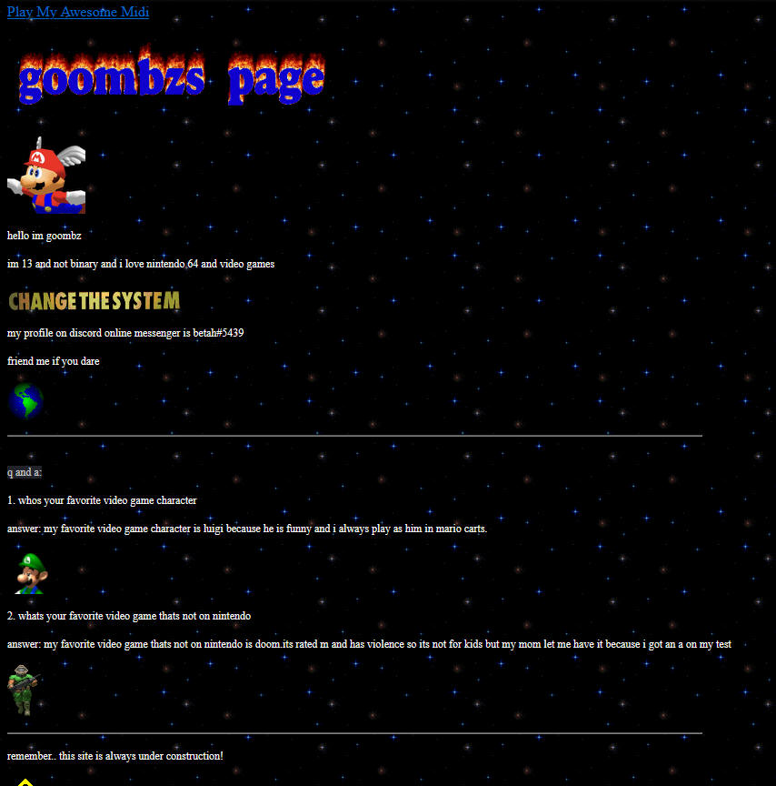
first of the posts on this You may have already noticed that I type differently here than I do throughout pretty much the rest of the site. I've never been very consistent with my writing. Anyways, I thought an interesting subject to cover would be the history of this site and how it, and my reason for making it, have changed over it's existence. I started this site around July of 2022. Well, hard to call really any of these the same site at all, other than the fact that they were all created by me and uploaded to Neocities. Well, I'll quit fucking around already and just show you how it looked. Warning, it's pretty bad.
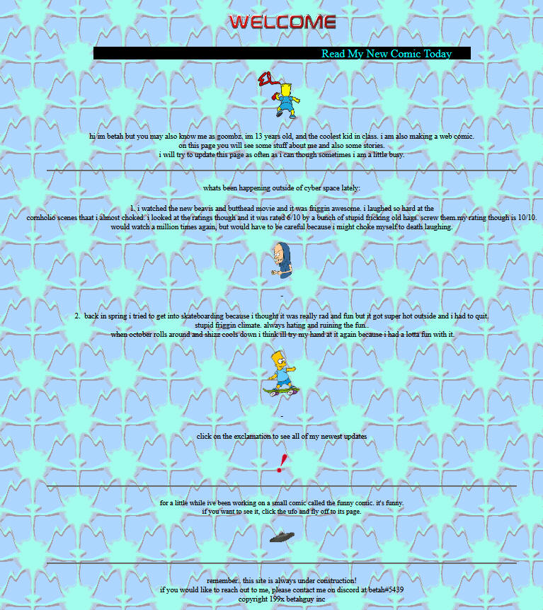
Jesus fucking Christ. This is basically just a very shitty stereotype of GeoCities pages. Not to judge anyone of course, but I think if you make a site you should have some sort of creativity beyond just funny gifs and midis. Something I clearly didn't have. My reason for making that site was because it was "web 1.0 '90s retro wow" and I thought that made it good. Don't get me wrong though, I think that other Web 1.0 aesthetics kick ass, and lots can be done with those. I'm just not huge on the idea of devaluing your site with shitty gifs and moving backgrounds for no reason other than "it's funny." I didn't even have it in me to make it actually represent me in any way, apparently. I talk like a 9 year old throughout the entire page. The only thing about myself I even make available is just "im 13 (lying through my teeth) and not binary (not the case anymore) and im a dumbass duuuhrrrr look at how dumb i sound get it because its fucking ironic." It honestly just makes me really angry. I think personal websites are a place for you to put yourself, your interests, your talents, etc. out into the world for people to see. This is just intentionally shitty gif salad with no meaning whatsoever other than just to be ironic. Well, enough about that one. Let's move on to my later version of the site. Warning. It's not much better. Like, at all.
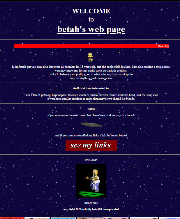
Yup. Also, ow. You can't see it from this image obviously, but this is a gif background and holy shit is it fucking nauseating. Same shit as the last one but in a new flavor. A fucking sickening one. I'd argue this is worse than the last one, actually. There's so much shit happening that I feel actual nausea coming on just looking at it. No idea what made me think this was remotely good, even as a GeoCities thing. Moving on now...
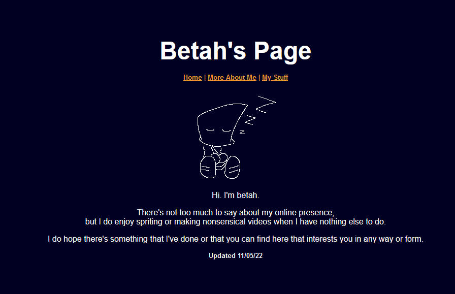
Same shit, again. It's better in some ways, but not much has changed. That star background you see is scrolling and it is fucking eye straining to look at combined with everything else. Not much else to say about this one though. Somewhere down the line, I realized that making a website isn't even worth doing if all you do is pump it full of shit and make it entirely uninteresting all around, not even giving anyone the slightest idea of who you are. And with that revelation came the next version of my website.
...Yeah, it's not really all that. I was still pretty dry on creativity while making this. I like the little gifs of my character Bagboy I did though. It was definitely a step forward from what I had going before, but it was pretty boring and not fun to look at. There was nothing to really keep people looking at the site for more than maybe 2 minutes. Wrapping up, I'd like to state that none of anything I said was meant to judge or put people down, but rather to just give my opinion on the subject. You all can do anything you want and express yourselves in any way you want to. I'm cool with that. Anyways, I hope you all enjoyed seeing how far this site has come and reading all the dumb stuff I had to say. I had a lot of fun writing this so I'm absolutely sure I'll be posting here quite a bit. Peace. |


